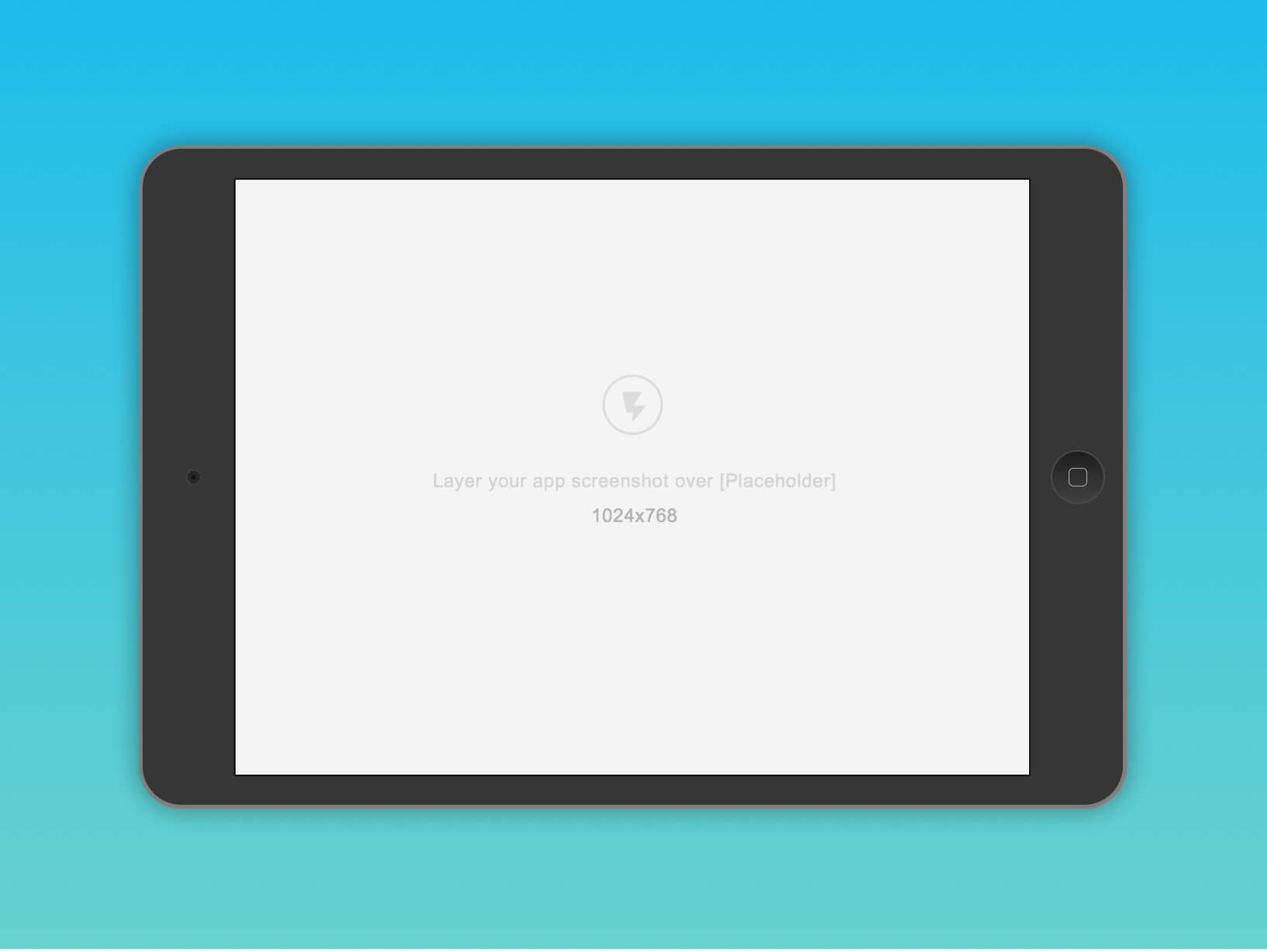
Needed a really simple template to showcase some of the iPad stuff I’m working on. Simplified the amount of gradients and strokes to let the app shine but still get the point across. Originally thought of making wireframy ones, but ended up with this so it feels slightly more tangible. Hope this would be of help to some folks, especially those using sketch.


