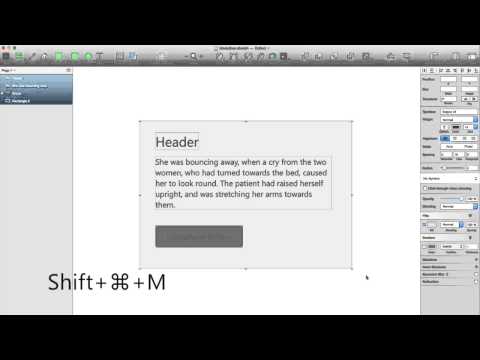
Modulizer plug-in for Sketch.app allows you easy control paddings for buttons, modules and areas. If your module has background your can set fixed paddings and easy restore it for any content changes.
Use cases:
- Merge selection to group and save the paddings in bottom background layer
- Restore paddings after content changing
- Change paddings value on bg layer name and update it’s
Demo
How to use:
- Create a background element: Draw a rectangle1 for your background element.
- Create your content: Content can be a single element (like a text box) or a group of elements. (Text boxes, rectangles, or any other group of elements.) Modulizer is smart enough to base the padding off of whichever element is on the bottom, so ensure that all of your other elements are arranged in front of your background element.
- Run the Plugin: Highlight the content and background and ⌘⇧M.
- Enter your settings: The window accepts pixel values in the same order as css.
- Modifying settings: ⌃⌘⇧M lets you set new values. Alternatively, you can rename the background layer with your desired padding values and rerun ⌘⇧M.
1 You can also use an ellipse, but it doesn’t work well with a perfect circle on a rectangular element. For most consistent results, use a rectangle.
CSS order
Enter in your values in the order of Top, Right, Bottom, Left.
- Entering 1 value will cause all padding to be the same (e.g. “10” for 10px of padding on all sides)
- Entering 2 values will apply the first value to Top and Bottom, and the second value to Right and Left (e.g. “10 20” would be the same as entering “10 20 10 20”)
- Entering 3 values will set unique Top and Bottom values, but identical Right and Left values. (e.g. “10 20 30” would be the same as entering “10 20 30 20”)
