 Submit
 Go to Plugin Page
Sketch.app plugin to apply design tokens (specified in LESS OR SASS format) to Sketch layers (with shared styles). Also Puzzle Tokens can generate Styles Overview.
Check this article to get a detailed overview with examples and join Spectrum Chat for live talk
Installation
- Check provided examples
- Unarchive and install
- Download and install Node.js
- Instal less or sass using the following Terminal commands:
sudo -s
npm i less -g
npm i sass -g
- Now you’re good to go!
Usage
- Download Example 1.
- Open Library.sketch file in Sketch.app
- Run Plugins > Puzzle Tokens > Apply Design Tokens menu command
- Specify LESS file according to screenshot
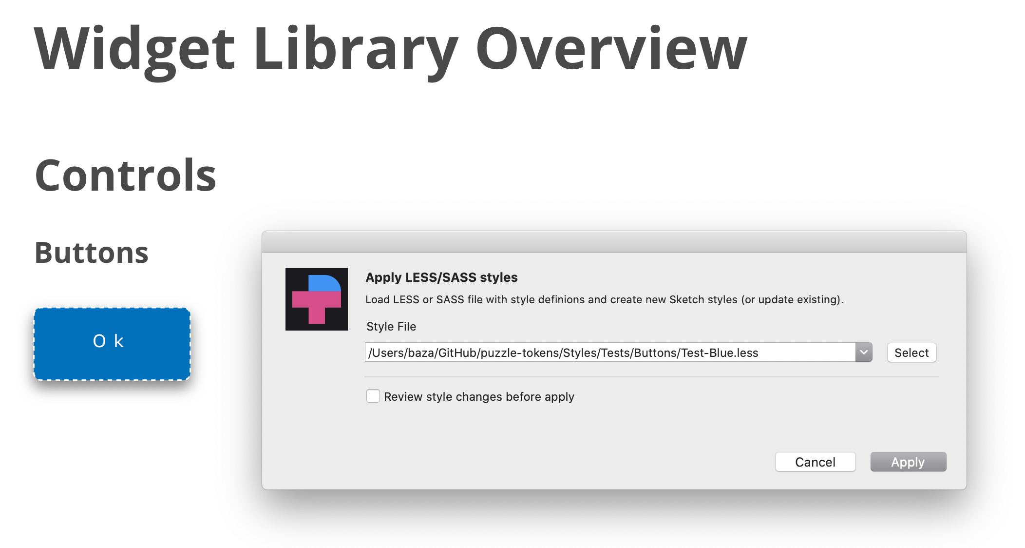
- Repeat the same operation, but select “tokens-blue.less” file. See how styles and widgets look now.
Features
The following styles are supporting.
// Text Layers

.TextStyle {
    font-size:             12px;
    font-family:           "Open Sans"; // or "Open Sans","Times New Roman"
    font-weight:           bold;      // or extra-light, light, regular, medium, semibold, bold
    font-style:            italic;    // or normal
    line-height:           1.0;       // or 1.2 or 1.5 or any other mulitplier for font-size OR 10px
    color:                 #FFFFFF;
    opacity:               63%;       // supported "63%" or "0.42"
    text-transform:        uppercase; // "uppercase", "lowercase", "none"
    text-decoration:       underline; // "underline", "line-through"
    text-align:            left;      // "left", center", "right", "justify"
    vertical-align:        top;       // "top", "middle", "bottom"
    letter-spacing:        10px;      // <value>px OR "normal"
}

// Shape layers

ShapeStyle {
    background-color:      #B0AFB1;
    background-color:      linear-gradient(45deg, #000000,#B0AFB4);
    opacity:               63%;       // "63%" or "0.42"
    border-color:          #000000;
    border-width:          2px;
    border-style:          dotted;    // dotted OR dashed
    border-position:       center;    // center OR inside OR outside

    // !!ATTENTION!!
    // Shared styles don't include radius property,
    // still you can set the radius-border for a style.
    // Border radius will be reapplied to layers
    // through style assigned to it. You can also
    // apply it to the layers or symbols directly.

    border-radius:         5px;
    border-radius:         5px 5px 0 0;

    box-shadow:            0 10px 20px 2 rgba(0,0,0,0.1);
    box-shadow:            inset 0 10px 20px 2 rgba(0,0,0,0.1);
}
You can look into more examples to get familiar with the plugin.
Required Style Properties
To apply text style you need to defined at least one of the following properites:
- color
- font-family
- font-size
- font-weight
- text-transform
- text-align
- vertical-align
For layer style:
- background-color
- border-color
- box-shadow
- border-radius
- opacity
To create _image:
- image