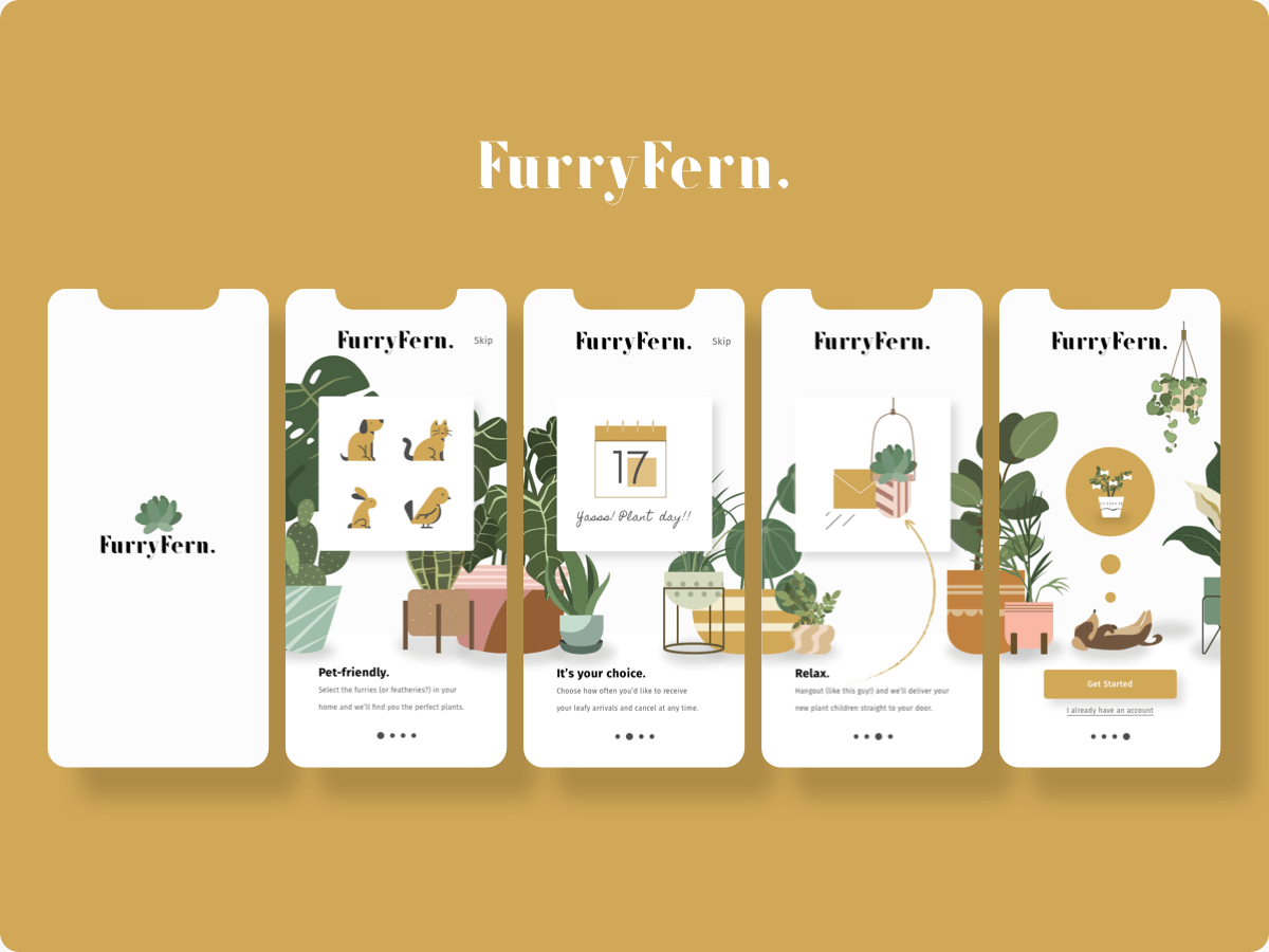
Hi folks, I’m happy to show you a new simple shot in my layout exploration series. If you follow me for a while, you can see I made a lot of layouts for the portfolio exploration – Some good, some bad but I still keep practicing every day. And today, I am gonna share with you a time-lapse video and you can see how I make the design, some part looks so slow and stupid, I make then remove, make then remove over and over… Finally, I get one I’m pleased with. So I hope you enjoy the video and you can download the Sketch file in the attachment if you like.


