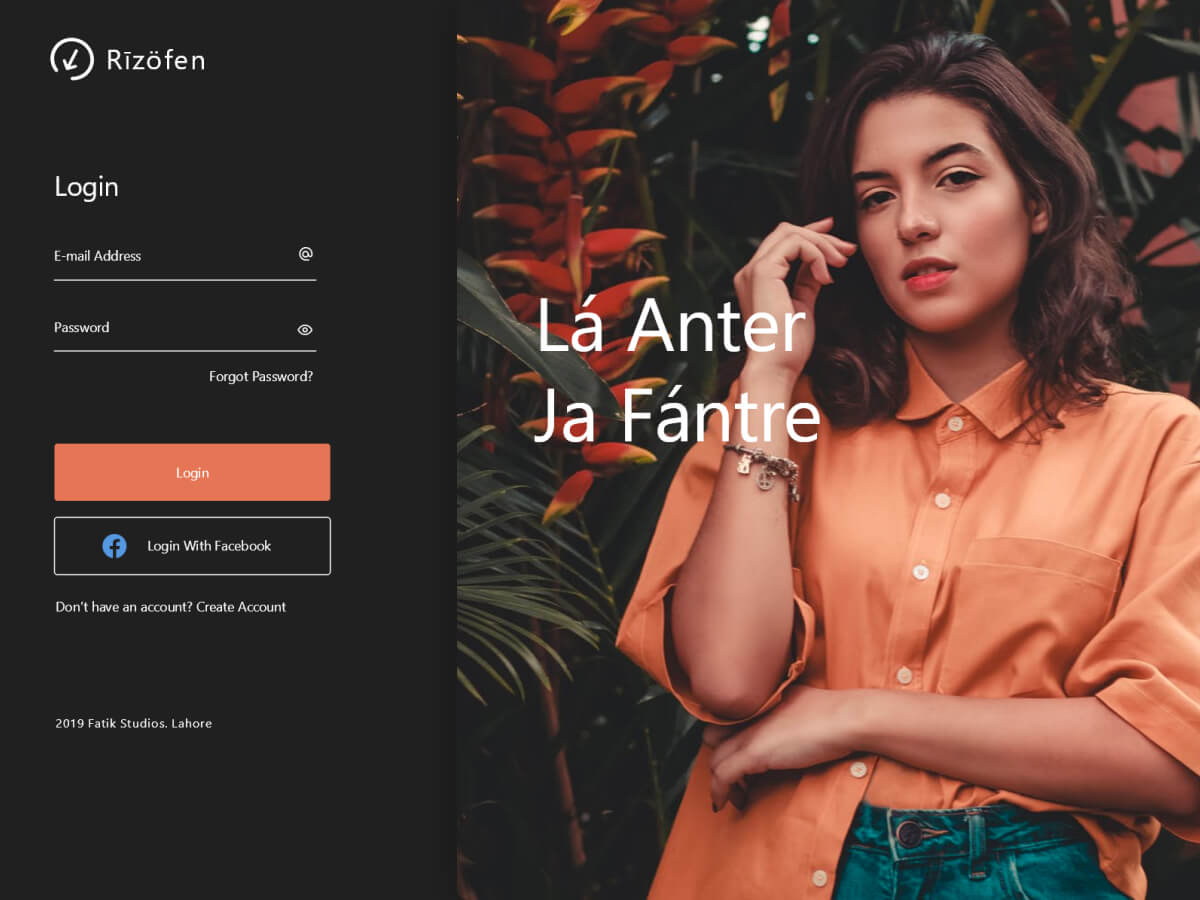
I’ve decided to create a UI resource almost everyday and post it online along its source file. The login page with the picture of a girl is looking nice not only because the girl is nice looking, but the trick was to grab the color palette from the photograph itself. The darkest color in UI is not darker than the darkest color in photograph. This create a sense of unity, and make every part seems like they belong to each other. The font used is Cereal by Airbnb, which I am currently obsessed with. Have fun with the resource
